Sustainability & e-commerce - Distancify
Using UI/UX to provide customers with needed information about the clothing in order to prevent unnecessary returns



This project involved UX methods to explore different solutions in order to deal with a big sustainability problem within e-commerce - returns
Overview of the project
The company Distancify works as consultants for different companies within e-commerce. They offer tailored e-commerce solutions for their customers. In this project we were asked to do a usability test in order to locate problems within the webdesign at RevolutionRace.se. RevolutionRace sell outdoor clothing of all sorts – from jackets to hiking pants and gears.
Main problem and assignment
The company expressed difficulties with a sustainability issue – returns. The goal with this project was to improve the user experience when choosing size and leaving customer reviews about the clothes. A better user experience could then lead to less unnecessary returns.
My role in the project
In this project we all alternated in taking on the project leading role every week. We also took turns in taking notes and being secretary. My role in this project was to bring creativity to the front, find different ways to enchance and build up our different ideas.
Tools/programmes used in this project
- Figma
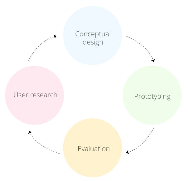
UXD-cycle
The purpose of the project was to practice all the UX methods within the cycle.
- User research
- Conceptual design
- Prototyping
- Evaluation
These 4 methods acted as building blocks in the project’s design process with continuous iteration.
User research
During the user research each group member interviewed 2 people and in total 8 people were interviewed. We also put out a survey on the internet so we could get some more information regarding shopping online. 20 people responded to the survey that was put out. 3 observations were also made of peoples way to shop online.
- Majority of the respondents use the filter when shopping clothes online
- Majority also look at the customer reviews before deciding to buy something
- When returning clothes the biggest reasons were wrong size, fitting, color, material and quality
- When reading customer reviews the most important thing that they searched for was; how the garment fits the body and the quality
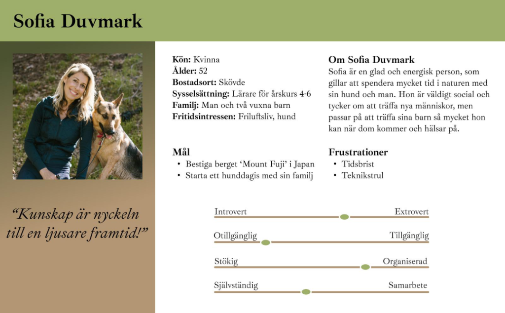
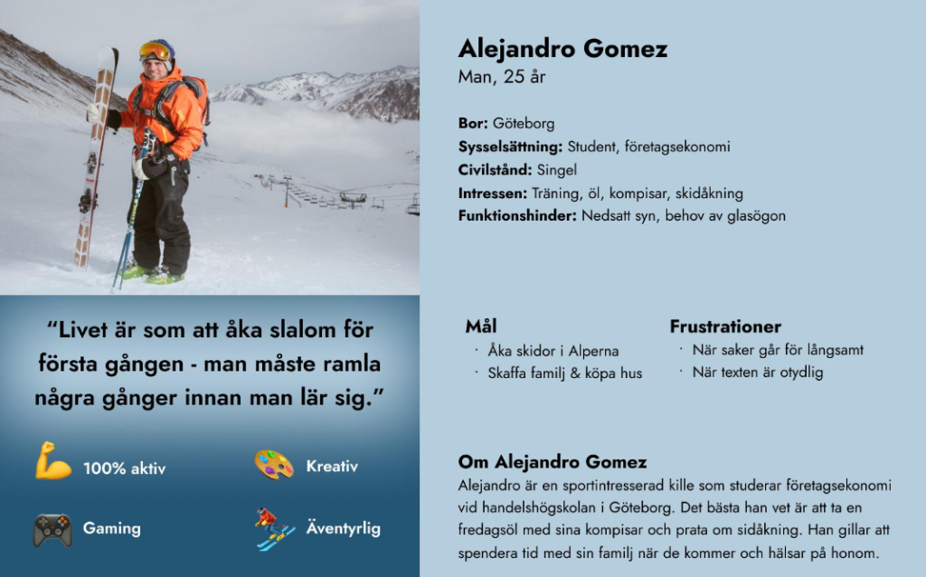
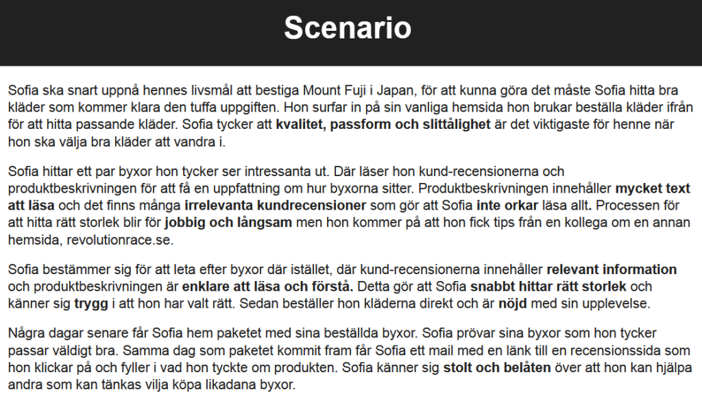
After establishing user needs 2 personas were then created and a scenario of a user context.
Conceptual design
After getting a good understanding of the users goals and needs, the next step was to try to create solutions for the company and their website.
- Brainstorming
- Concept sketches
- Conceptual model
Brainstorming
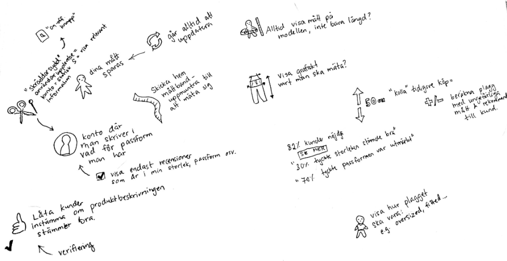
Brainstorming was the first method implemented in the phase conceptual design. This method was used to be able to generate as many different ideas as possible.
Sketches
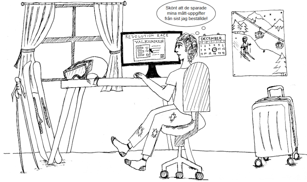
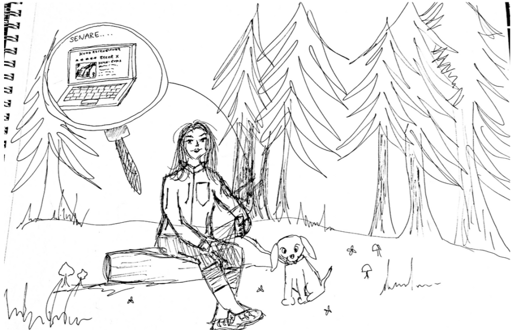
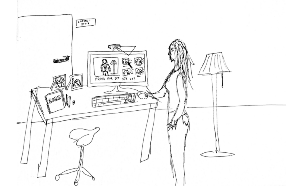
We started the sketching process with writing out different scenarios, then everyone got to sketch for 15 minutes. Then we picked out the sketches we liked the most, the sketch to the right was then re-made to a more neater sketch.
Conceptual model
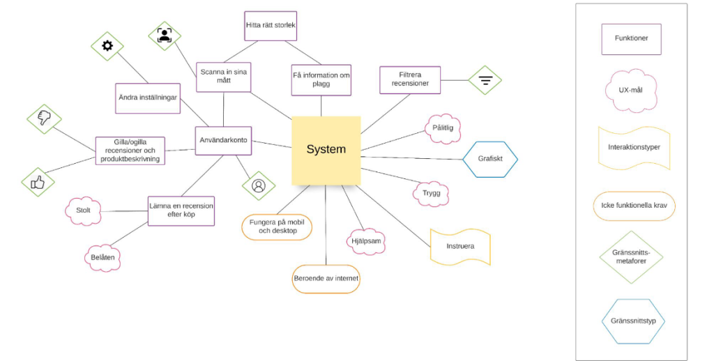
A conceptual model was created to get a holistic view of the entire system and its different steps.
Prototyping
The final step was to create a mid-fi prototype out of wireframes and sketches. The prototype was made through the program Figma. The prototype included 7 different pages and functions.
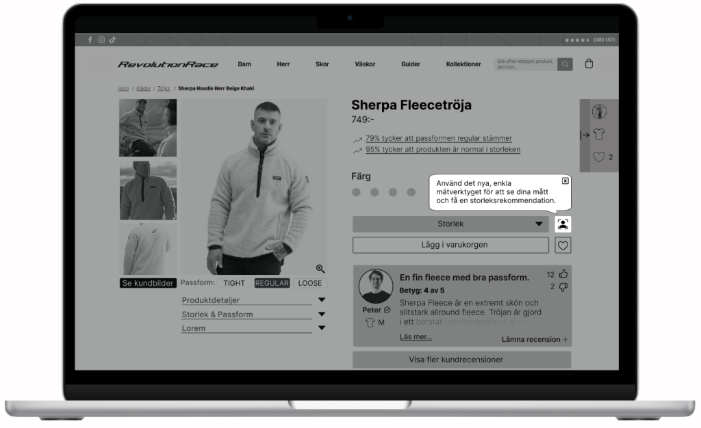
Changes within the PDP
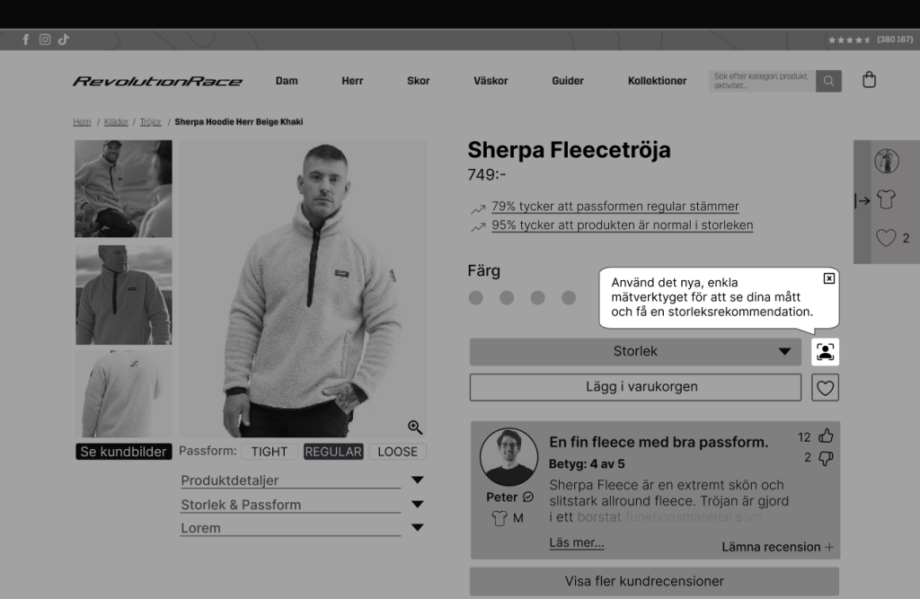
The changes that were made to the PDP were following;
- A fixed profile with recommended size near the side
- Easier way to read relevant data from customer reviews
- Easier access to see what colors each product has
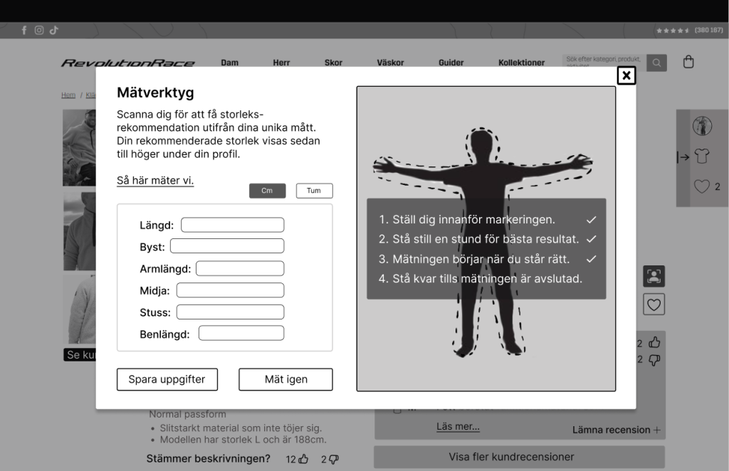
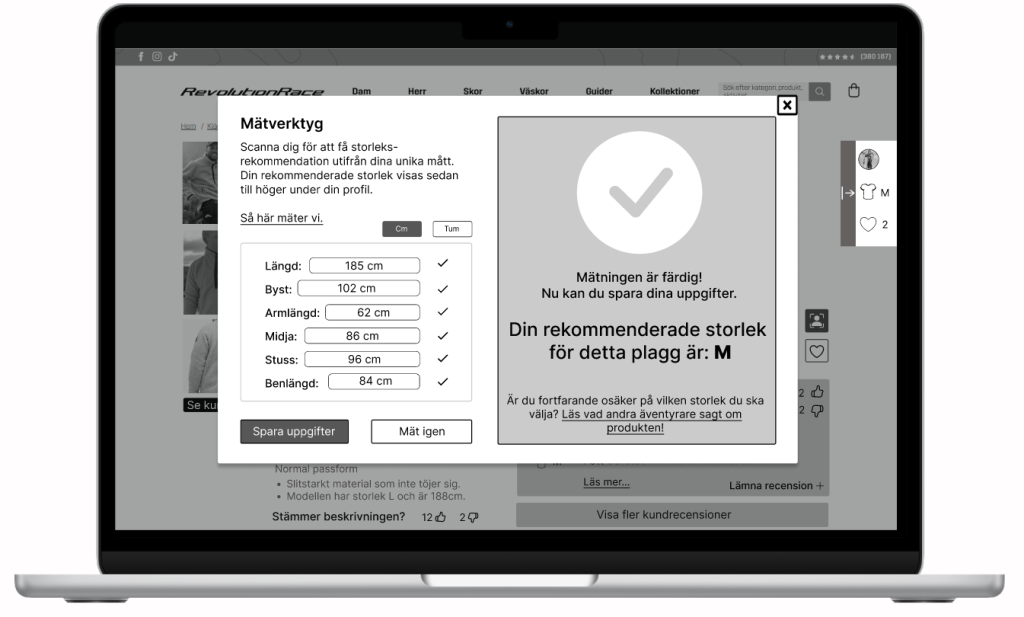
- Added icon with measurement tool
- Information regarding fitting of each clothing piece
- Easier way to access product details
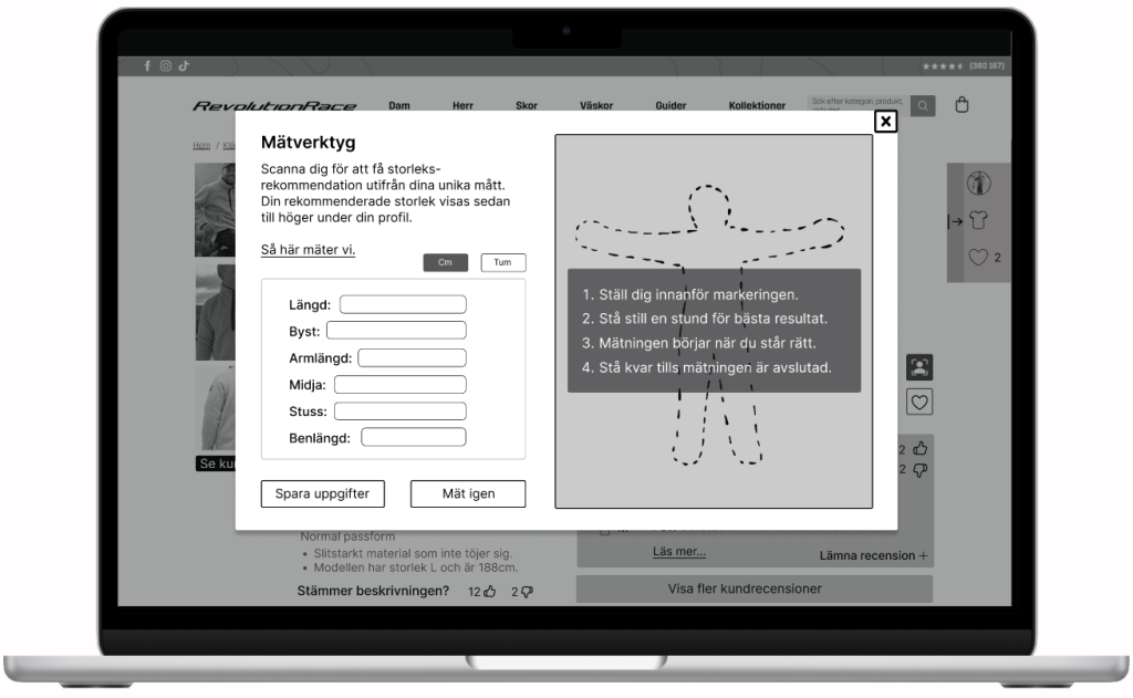
Measurement tool
The measurement tool was an idea that came up during the conceptual design phase. The idea behind this is to help users retrieve their measurements in case they do not have access to measuring tape. This was also based from the user research where we found problems regarding users not knowing their specific measurement details.
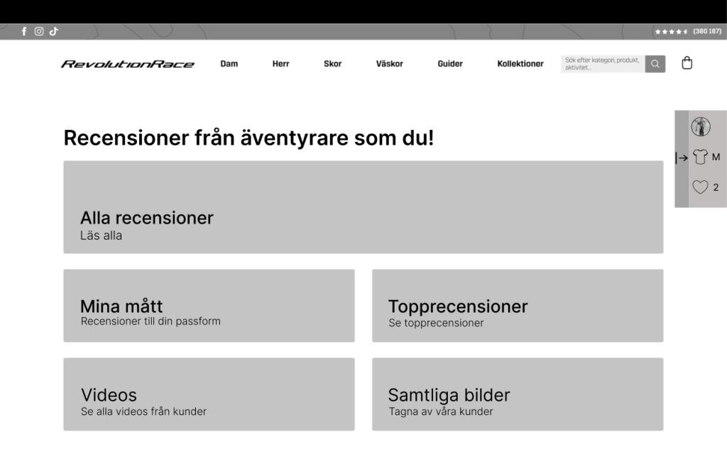
A more entertaining way to read reviews
The main idea with creating different buttons within the overview of all reviews was to have a more interactive and entertaining way to read the customer reviews. For example these buttons could lead to reviews with only videos, only pictures, top reviews or reviews that have same measurements like the user.
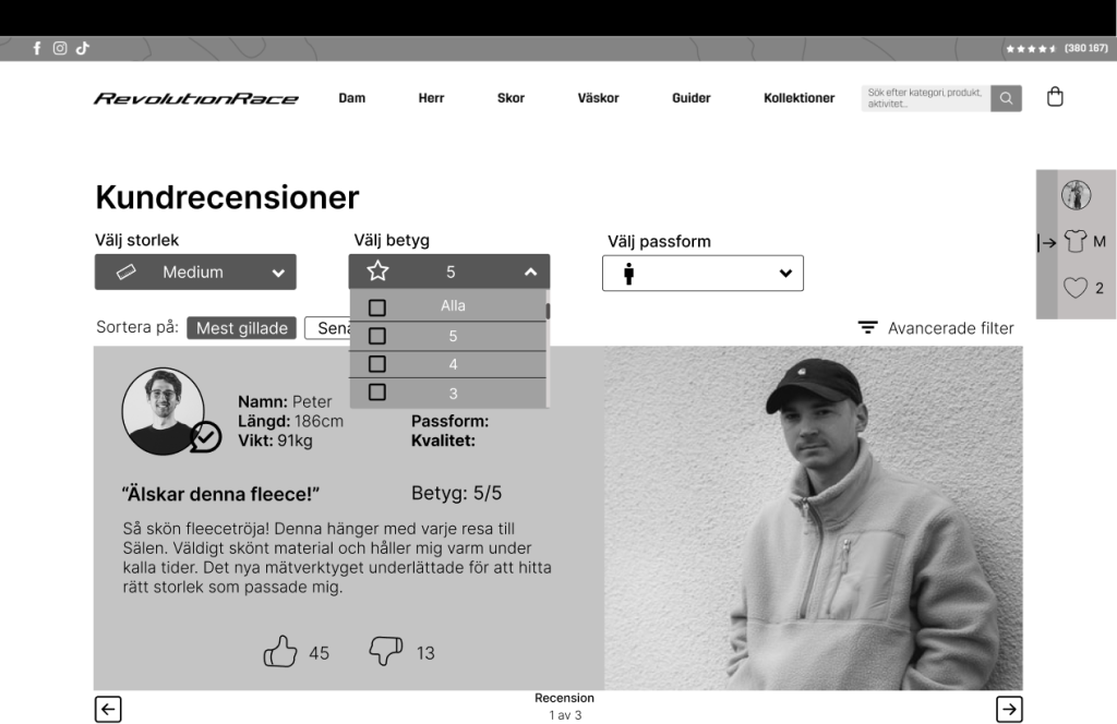
Filtering in customer reviews
In case the user decides to read all the customer reviews or clicks through from a PDP, the users have ability to filter through. The customer reviews would also include more detailed information and a function where other people can like the review or dislike. The idea behind this was to create some sort of community within RevolutionRace, but also to help users see what reviews were the most helpful.
Reflection
This project was very fun to execute and taught me a lot of valuable lessons to improve. One of them being that I need to speak up more and be more assertive. Another point is to not be afraid to put out my ideas to people I am not comfortable with.